An image is a powerful communication tool that can combine multiple complex ideas in a single media piece. This pervasive format makes its presence across various forms of communication. Images are ubiquitous across the web, and why wouldn’t they be? Almost everyone has heard the adage “a picture is worth a thousand words.”
Why do we need alt text?
Have you ever wondered what happens when those thousand words cannot reach your intended audience because they cannot see the image?
Alt text can bridge the gap in such instances.
Beyond the important and obvious reasons of equity, inclusion, and compliance with accessibility guidelines, there is a case for including alt text if only to ensure the completion of your communication cycle. We are primarily concerned with including image alt text for users who use screen readers. However, it can also be a failsafe when images do not load or when a user turns off images to save data, presenting vital information about an image to a user and minimizing communication gaps.
Three Best Practices for Writing Image Alt Text
Writing alt text is as much science as it is art. Here are some best practices for writing image alt text.
Write concise and precise image alt text.
It should convey adequate information for a user with visual impairment to understand the image in its entirety, but it should exclude extraneous information that is unavailable to a user who is looking at the image only.
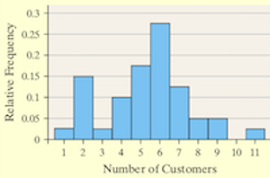
For example, the alt text for a bar graph should go beyond identifying it as a bar graph. It should describe the data in the bar graph, but it should not contain inferences that a user is supposed to arrive at after studying the graph, unless the graph contains these inferences already.
It should also exclude phrases such as “image/picture of” and “as seen below/above”.

An example of a bar graph. A vertical bar graph is drawn on a coordinate plane. The horizontal axis is labeled Number of Customers. The vertical axis is labeled Relative Frequency.
Supplement image alt text with additional text when necessary
Images such as graphs, infographics, or flowcharts need longer alt text than simpler or purely decorative images. Online platforms place limits on the number of characters/words that can be placed within alt text tags. One solution to overcome these limits is to follow the image with the required text content.

Avoid text-heavy images
If you have an image that contains a lot of text, consider replacing it with the text. Such images not only make writing alt text cumbersome, but they also lead to bad user experiences for users with visual impairment. These users may try selecting the text with a cursor or keyboard, leading to an unpleasant user experience.
What Does the End User Really Want?
Your primary goal when writing alt text is to communicate information in the image to the end user. You will meet your user’s expectations when you create an effective and inclusive user experience for all users.
You can also refer to this decision tree to find out whether you need alt text for a particular image, and the type of alt text required.
If you would rather let trained experts handle writing image alt text, we are here to help. Request a quote for our alternative text generation services, write to us at contact@continualengine.com.
Get High-Quality Alt Text & Image Accessibility
Experience unmatched accuracy with InvictaTM, the world’s leading generative AI solution for image alt text.
