

What Are Dyslexia-Friendly Fonts?
Dyslexia-friendly fonts, also called dyslexia fonts, are meticulously crafted typefaces tailored to facilitate reading for individuals with dyslexia. Unlike conventional fonts, dyslexia fonts are engineered to enhance readability and comprehension by making characters more distinct. Due to their mirrored or flipped similarities, traditional fonts often lead to confusing letters such as ‘p’ and ‘q’ or ‘b’ and ‘d’. Dyslexia fonts employ unique designs for each letter, ensuring clarity and minimizing confusion. For instance, fonts such as Dyslexie incorporate clearer baselines and emphasize capitalized letters, acting as anchor points that aid dyslexic readers in maintaining focus.The Importance Of Dyslexia Fonts
The efficacy of dyslexia fonts remains a topic of ongoing debate among researchers. While scientific evidence supporting their impact on reading accuracy is limited, anecdotal evidence from individuals with dyslexia suggests otherwise. Studies exploring specific dyslexia fonts such as OpenDys and Dyslexie have yielded varying results. Despite inconclusive scientific backing, many dyslexic users report significantly improved reading experiences with content presented in dyslexia fonts. Dyslexia primarily affects a person’s ability to distinguish phonemes, the sounds that make up words, rather than individual letters. Consequently, the impact of typefaces on dyslexic readers’ comprehension remains a subject of ongoing research. Although some studies highlight the importance of letter spacing, the choice of font alone may not be a magic bullet for addressing dyslexia. Nevertheless, the positive experiences reported by dyslexic users underscore the potential benefits of dyslexia fonts in enhancing the reading experience.Reasons Why You Should Incorporate Dyslexia Fonts On Your Website
- Enhanced Accessibility:
Implementing dyslexia fonts significantly enhances the accessibility of your website, ensuring it can be easily understood and navigated by individuals with dyslexia. These fonts mitigate visual challenges faced by dyslexic readers, such as letter and word distortion, creating a more inclusive digital space.
- Improved Readability:
Dyslexia fonts are crafted to enhance readability by featuring distinct letterforms and optimized spacing. This improved readability results in a more engaging reading experience for a broader range of visitors, making your content comprehensible to everyone.
- Positive User Experience:
Dyslexia-friendly fonts contribute to a positive user experience. When visitors find it easier to read and navigate your website, they are more likely to engage with your content, explore your products or services, and form a favorable impression of your brand.
- Expanded Audience Reach:
Despite being less common, dyslexia affects millions worldwide, making it a significant demographic. By accommodating this audience, you can tap into a more extensive user base that might otherwise be deterred by inaccessible text. Inclusivity fosters a diverse and engaged user community, potentially increasing the visibility and impact of your website.
- Increased Content Consumption:
Websites prioritizing accessibility tend to attract and retain more users. Easy-to-read content encourages visitors to consume it fully and share it with others, expanding your website’s reach and influence.
- Positive Brand Image:
Incorporating dyslexia fonts demonstrates a commitment to inclusivity and accessibility. It conveys that your business values diversity and is willing to accommodate the needs of all potential customers. This positive perception fosters goodwill, trust, and loyalty among your audience, benefiting your brand’s reputation.
What Are Factors to Be Considered When Choosing Dyslexia-Friendly Fonts?
When choosing dyslexia-friendly fonts for your website, several factors should be considered:- Use Sans Serif Fonts:Sans serif fonts such as Arial and Helvetica are simpler and easier to read, lacking the decorative strokes (serifs) in fonts such as Times New Roman.
- Optimize Letter Spacing:Adequate spacing between letters (kerning) prevents confusion between similar letters, such as ‘r’ and ‘n,’ ensuring clear differentiation.
- Consider Dyslexia-Specific Fonts:Fonts such as Dyslexie and OpenDyslexic are specifically designed for individuals with dyslexia. These feature unique letter shapes and emphasize letter differentiation to enhance readability.
Top 10 Best Fonts For Dyslexia
- Arial:
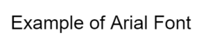 Clear and widely used, Arial is sans serif, making it easily readable.
- Helvetica:
 Evenly spaced and lacking serifs, Helvetica is a popular choice for dyslexia-friendly design.
- Comic Sans:
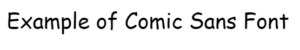 Despite controversy, Comic Sans’ playful design aids dyslexic readers in distinguishing letters.
- Verdana:
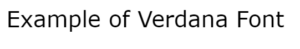 Designed for on-screen reading, Verdana features wide letter spacing and is highly readable even at small sizes.
- Century Gothic:
 Easy-to-distinguish letters and well-spaced design make Century Gothic accessible.
- Tahoma:
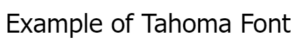 Bold and straightforward, Tahoma’s clear spacing enhances readability.
- Calibri:
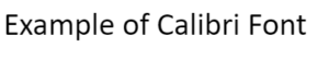 Widely used in Microsoft Office, Calibri features wide letter spacing, ensuring legibility in various sizes.
- Open Sans:
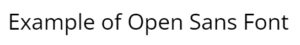 A no-frills font with clear spacing and rounded shapes, making it easy to read.
- Dyslexie:
 Specifically created for dyslexic readers, Dyslexie’s unique shapes enhance letter differentiation.
- OpenDyslexic:
 Free and open-sourced, OpenDyslexic prevents letter flipping with its distinct letter styles and spacing.
Tips For Making Digital Accessible Content
Besides choosing dyslexia-friendly fonts, consider these additional steps to ensure your website is accessible to a larger audience:- Minimum Font Size: Use a font size of at least 12 points to ensure legibility.
- Text Alignment:Align text left instead of fully justifying it, which can create irregular spaces between words and hinder readability.
- Simplicity In Language:Use simple and succinct language, avoiding unnecessary jargon or complex terminology.
- Screen Reader Optimization:Optimize your website for screen readers, enabling individuals with visual impairments to access your content effectively.
